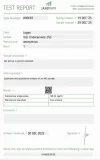
OK I'll keep an eye out for your results.I think thats the one I have, ordered early-mid December right after the Chinese Primo. I am sending for testing this week. Will update once I get results back.
Navigation
Install the app
How to install the app on iOS
Follow along with the video below to see how to install our site as a web app on your home screen.
Note: This feature may not be available in some browsers.
More options
Style variation
You are using an out of date browser. It may not display this or other websites correctly.
You should upgrade or use an alternative browser.
You should upgrade or use an alternative browser.
MESO-Rx Sponsor Primal Pharma - US Domestic
- Thread starter Primal_Pharma
- Start date
-
- Tags
- primal
Photon
Member
I think thats the one I have, ordered early-mid December right after the Chinese Primo. I am sending for testing this week. Will update once I get results back.
Please add GCMS to the test.
oldage
Member
Marketing worksI do. What are you gonna do about it?
Photon
Member
Cross production contamination is something to take note of..
Where is it from?
If it's from brewing equipment like beakers not being washed properly..then there might be harsh chemicals used for cleaning the lab present...
If it's from reusing filters..(why? they're so cheap), then there exist an issue about overused filters..and sterility..
I remember asking for raw reports for this multiple times but i don't think they were ever tested either.

Photon
Member
Today I was reorganizing my stash and laying out your products. Man… the label really is an eye-catcher, and not in a good way.
I get it, it’s “just a label,” quality matters more, but let’s be honest, presentation still counts. Right now it doesn’t really grab the eye like some other vendors’ designs do, and that’s a missed opportunity in my opinion.
Purely personal take, but it might be worth talking to your guys and stepping the design up a bit. Something cleaner and more polished, maybe along these lines…
View attachment 372697
You could even do a black limited edition version like this…
View attachment 372698
That’s the kind of look where I’d go “okay, now this hits different.”
PS: I’m not commenting on product quality at all, just the aesthetics. A small design upgrade could go a long way here.
Is this .psd?
I'll pay for it lol
Will do!Please add GCMS to the test.
Trena100
Member
Is no one wondering where primal is?
osqe
Member
Nah, the ape is neededToday I was reorganizing my stash and laying out your products. Man… the label really is an eye-catcher, and not in a good way.
I get it, it’s “just a label,” quality matters more, but let’s be honest, presentation still counts. Right now it doesn’t really grab the eye like some other vendors’ designs do, and that’s a missed opportunity in my opinion.
Purely personal take, but it might be worth talking to your guys and stepping the design up a bit. Something cleaner and more polished, maybe along these lines…
View attachment 372697
You could even do a black limited edition version like this…
View attachment 372698
That’s the kind of look where I’d go “okay, now this hits different.”
PS: I’m not commenting on product quality at all, just the aesthetics. A small design upgrade could go a long way here.

Trena100
Member
I’m honestly more of a discreet fan, I don’t want the name of the seller I’m buying from on the bottle, maybe just the ape pic but that’d be it
dcfreak
Member
Yeah I don't care about the label at all either. As long as I can read the concentration (another vendor this is an issue IMO) it could have a dynamo label on it with a rainbow cap on the top.
Im more concerned it is properly dosed, tested, and has proper hardware.
Im more concerned it is properly dosed, tested, and has proper hardware.
I was genuinely kind of wondering that. He’s been pretty quiet lately, especially with all the concerns being brought up. Definitely bums me out because I have been a big supporter and spent a lot of money here since day 1. Was really hoping he’d come back with some quality answers. @Primal_Pharma ???Is no one wondering where primal is?
newguy2
Member
For some time now he looks to have made the decision to stay out of most of the conversation. He made a post about it at some point sounded like the admin had said something.I was genuinely kind of wondering that. He’s been pretty quiet lately, especially with all the concerns being brought up. Definitely bums me out because I have been a big supporter and spent a lot of money here since day 1. Was really hoping he’d come back with some quality answers. @Primal_Pharma ???
Ateam2023
Member
Figuring out his next set of liesIs no one wondering where primal is?
dcfreak
Member
He said he was traveling
AlexDavis43
Member
For some time now he looks to have made the decision to stay out of most of the conversation. He made a post about it at some point sounded like the admin had said something.
Like, the admin scolded him for something in this thread?
BumpassHell
New Member
Haha. Love it. And especially the african primate in a Mexican/Central American jungle.Nah, the ape is needed
View attachment 372854
Oldhand
Member
For some time now he looks to have made the decision to stay out of most of the conversation. He made a post about it at some point sounded like the admin had said something.
If I remember correctly, it was about all the GIFs in this thread. Don’t quote me on this!Like, the admin scolded him for something in this thread?
The time period was around the time Bandern, DoubleDeez and some others got banned. I think these bans were for multiple accounts.
I have to admit those were fun times. Yes the thread was a total clutter but I laughed every day.
Oldhand
Member
Good eye. I saw green leaves and totally overlooked the pyramids.Haha. Love it. And especially the african primate in a Mexican/Central American jungle.
I’m just focused on work and not paying attention to the noise anymore. It’s the same five people saying the same things over and over, and it’s gotten old. I used to go out of my way trying to please everyone, and that’s not happening anymore.I was genuinely kind of wondering that. He’s been pretty quiet lately, especially with all the concerns being brought up. Definitely bums me out because I have been a big supporter and spent a lot of money here since day 1. Was really hoping he’d come back with some quality answers. @Primal_Pharma ???
There are a few mistakes that keep getting brought up by those same people. I’ve read through ALL other sponsored threads, and honestly it makes me laugh. We’ve made mistakes, no denying that, but compared to what I’ve seen from other sources, it’s actually laughable.
We’ve said it before, but the plan is to go private, and we have plenty of clientele to do that without issue. We take care of the people who support us, and there’s a reason they keep coming back. If someone is just hanging around with no intention of buying and only here to stir things up, they’re more than welcome to move on.
Ateam2023
Member
GoodbyeI’m just focused on work and not paying attention to the noise anymore. It’s the same five people saying the same things over and over, and it’s gotten old. I used to go out of my way trying to please everyone, and that’s not happening anymore.
There are a few mistakes that keep getting brought up by those same people. I’ve read through ALL other sponsored threads, and honestly it makes me laugh. We’ve made mistakes, no denying that, but compared to what I’ve seen from other sources, it’s actually laughable.
We’ve said it before, but the plan is to go private, and we have plenty of clientele to do that without issue. We take care of the people who support us, and there’s a reason they keep coming back. If someone is just hanging around with no intention of buying and only here to stir things up, they’re more than welcome to move on.
Similar threads
- Replies
- 14
- Views
- 1K
- Replies
- 16
- Views
- 2K
- Replies
- 15
- Views
- 2K
- Replies
- 304
- Views
- 22K

